


10 Best Practices For Beautiful UX Design


Great design is memorable.
In fact, we may not like to admit it, but in the modern world, design has a huge role in shaping our perception of the world at any point in time.
Reputable brands understand this; legendary brands capitalize on it.
Take Apple, for instance. If it wasn’t for Steve Jobs’ passion for minimalism, the iPhone’s success story would literally look a lot different today.
This is because like all great designers, Steve understood that people are likely to remember a bad design just as much as a good one.
With that thought, he focused on creating simple yet highly functional products: products that looked good but worked even better.
Or, as he had once famously said: “Design is not just what it looks like and feels like. Design is how it works.”
You, as a User Experience Designer
As a User Experience (UX) designer, there are plenty of things you can learn from Steve Jobs’ love for design, especially when you’re trying to build a flawless brand experience for your customers.
But how can you create flawless user experiences? What is it that makes a design truly exceptional? In this blog, we’ll go through the 10 best practices you can use to create truly memorable user experiences.
Let's dive in
Top 10 Best Practices To Elevate Your UX Designs
1. Think like a consumer, not a UX designer
While this may seem fairly straightforward, most UX designers make the mistake of overlooking this basic principle.
Before creating a website, app or product, it is necessary to understand the needs of the end user.
- What problems are you trying to solve for them?
- How is your product solving this problem?
- How can your website show the customer you’re solving this problem?
This should set the tone for the rest of the design process.
A wireframe, complete with menus and buttons, can serve as a helpful guide in assessing the overall experience of your consumers, especially in the early stages of development.
Case Study Spotlight: How Brio Used Superside to Revamp Their Brand Experience
At the height of the pandemic, Brio realized that they need to pivot their business and their brand. Repositioning as a COVID testing logistics service, they quickly found success in developing an efficient and reliable service for healthcare professionals.
However, in the speed of their pivot, they had no time to redesign their brand experience to focus on healthcare professionals. You know how much time it can take to recreate a UX experience — which is why Brio chose to work with us.
Using Superside, Brio was able to focus on creating a brand experience that focused on reliability, professionalism and dependability. From their core logo to event merchandising, Superside provided a complete suite of design services that ensured Brio was presenting a user experience that would be understood by their consumer.
Read More: How Brio Used Superside to Understand Their Market Audience


Your roadmap to navigating design leadership
Jam-packed with advice on how to build high-impact design teams. Featuring Adam Morgan, Samantha Berg, Shachar Aylon and more.
2. Sitemaps are your friends
Nothing is more frustrating than struggling to find what you’re looking for on a website or an app. When there is a clear hierarchy of content along with a functional search bar, it decreases the chances of your customer leaving your website.
In designing your website, ensure that ease of use is at the forefront of your process. Make the path from a customer entering your website to purchasing your product as quick and seamless as possible.
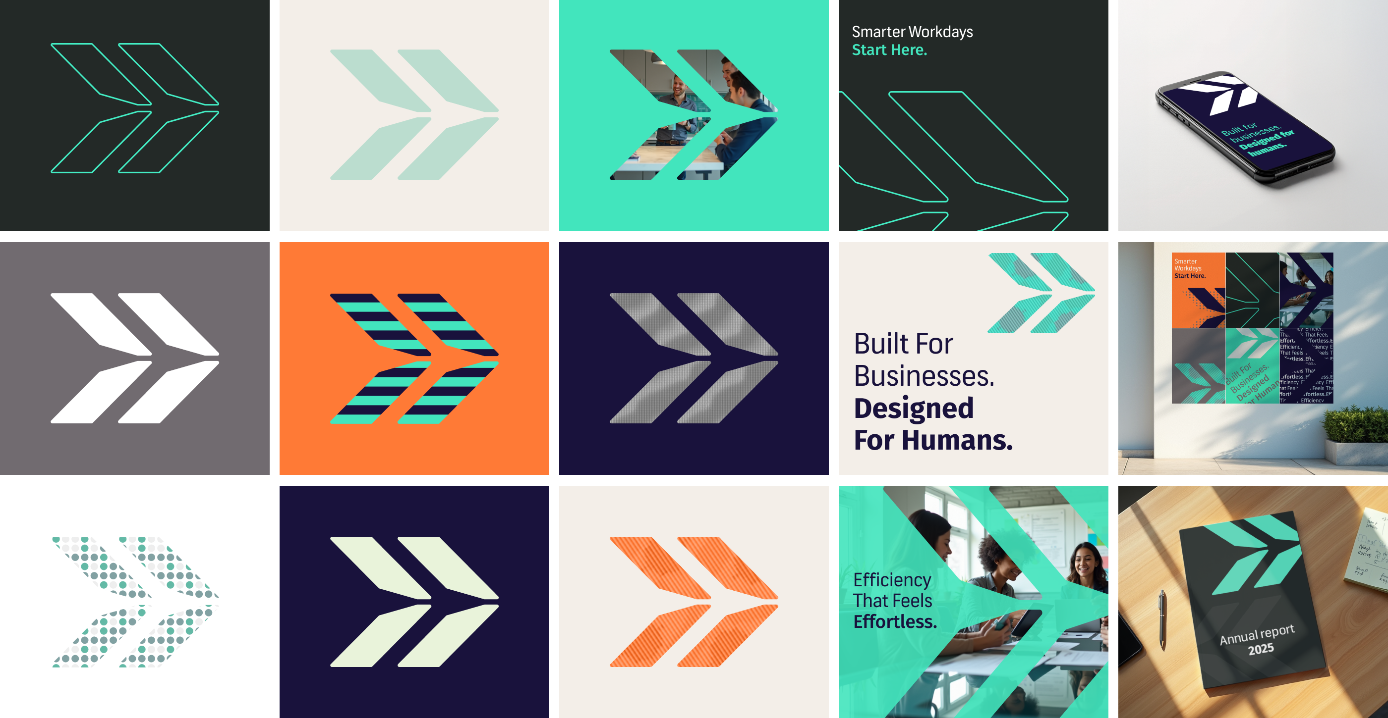
3. Consistency is key
Building a seamless user experience involves creating a cohesive design across all platforms. Whether it’s the colors, font or any other element of graphic design, having visual consistency will make it easier for end users to navigate their way around your website or app.
Remember, you don’t need to make every app, product, or web design look the same, but try and aim for some sort of visual similarity. For instance, experimenting with too many font sizes or styles on the same page can confuse a potential consumer.
Case Study Spotlight: How TransACT Used Superside to Create a Consistent Brand Experience
TransACT has recently found itself with an excellent problem to have: exponential growth. TransACT is a full-service provider of software solutions that help K-12 school districts more efficiently meet state and federal requirements, reduce operational complexity and more safely and effectively serve their students.
With the arrival of the pandemic, they began to see an explosive level of growth, quickly acquiring a number of businesses and expanding their current services. Eventually, they had 13 subbrands to manage, along with their own rapidly shifting business.
Creating branded assets for each company was quickly becoming a challenge, with every asset having to be signed off on and double-checked by multiple stakeholders.
By pairing with Superside, TransACT was able to create comprehensive brand guidelines and an extensive style guide that allowed each member of the 70-person-strong marketing team to work independently and without any design bottlenecks. Now, with a consistent brand identity, TransACT has sped up its creative and marketing processes by a factor of 70.
Read More: How TransACT Achieved 70X Design Capacity


Bridge the gap
Based on an original survey and 100+ hours of interviews with industry leaders at Shopify, Intercom, Twilio and more, this guide identifies the core dysfunctions between marketing and design teams and how to fix them.
4. Clear the clutter
As a designer, it helps to remember that less is more. While you may be tempted to use countless animations or imagery on the homepage, visual breaks in the form of whitespace can help in giving your customers some breathing room.
Much like Steve Jobs’ design philosophy, it is a good idea to keep your website or landing page design simple with minimal elements and plenty of negative space to help viewers focus on essential content.
5. Test the waters
The only way you’ll be able to tell if your UX design works is by having real people test it. Conduct usability tests such as card sorting, screen sharing, guerrilla testing and user interviews before launch.
6. Everybody loves accessibility
If you’re trying to reach a wider audience, you’ll need to keep in mind the needs of all categories of consumers, including the ones with disabilities.
In your design thinking process, ensure that your website or app can be accessed by everyone, you’re not only creating an inclusive experience for your consumers, but you’ll also gain more viewership or subscribers.
A great way to do this, for example, is to include assistive technologies and visual design like screen readers or zoom-in features for people who are visually impaired.
7. Update your interaction design
Design processes should never feel static. Feel free to experiment with new graphic design ideas and features every once in a while.
But before you go live, remember to create a test page for it. This way, you can redirect some of your website traffic toward that page.
Once you’ve collected enough data, you’ll be in a better position to know whether to keep the new update or stick with the old design. It’s interesting to note that an increasing number of UX designers are now relying on artificial intelligence (AI) to analyze consumer behavior and conduct user testing so they can personalize features accordingly, depending on user feedback.
Read More: How PointCard Used Superside to Refine Their Experimentation Process (and Boost Ad Performance by 240%)
8. User Interface design
User Interface (UI)design refers to the process of making a device, website or app interactive. This involves using interaction designers and tools during your website or app development process that can help increase the responsiveness of a brand or service.
As an essential part of the user experience, UIsgo a long way in helping end users get closer to finding solutions to their problems. A classic example of this is Google, the company that believes: “Focus on the user, and all else will follow.” Known for rolling out new interfaces, Google continually strives to streamline all of its apps and services in order to maintain a high level of usability amongst its users.
9. Cool it with the clicks
As a UX designer, it should be your goal to help consumers get from point A to point B using the least number of clicks possible. This will minimize the time they need to get things done without creating any unnecessary distractions along the way.
The same rule applies to pop-up windows which can cause end users to lose their train of thought while trying to make a purchase.
Pop-ups are helpful in getting a customer’s attention but can cause much annoyance: especially when there are too many of them. Remember, less is more.
10. Keep your forms to the point
Nobody likes filling out long forms. Instead of asking for everything under the sun, include only relevant fields that will help you quickly get the information you need. Again, think like the consumer and show respect for their time.
Most UX designers and experts agree that the best way to design forms is to arrange all fields in a single column. This way, end users can easily scroll down through the form and fill out each field as needed.
How To Measure The Success Of Your UX Design
So now that you have followed all the best practices for creating the ultimate UX design, it’s time to evaluate its effectiveness.
Here are a few metrics that can prove helpful in measuring user satisfaction, and eventually the usability of your website or app:
1. User Error Rate (UER)
As the name suggests, this is the rate at which end users make mistakes in carrying out tasks on the website.
A simple way to calculate this is to divide the number of errors by the number of attempts made. If this number is high, then it indicates that the website or app has high usability problems that need to be fixed. For example, if out of 100 users, at least 40-50% reported having the same problem on the website, it needs your immediate attention.
2. Task Success Rate (TSR)
This indicates how successfully an end user can complete a particular task on the website.
Keep in mind that success rates can only be measured if each task has a clearly defined goal such as filling out a signup form or adding items to the shopping cart. Simply divide the number of fully completed tasks by the number of total attempts.
3. User Retention Rate (URR)
Ultimately, you need to measure the long-term success of your design. One way to do that is to calculate the retention rate, or the percentage of users who continue to use your website or app over a period of time.
This can be found by dividing the number of users on the website on any given day by the number of users on launch day or day 1.
4. Task Completion Rate (TCR)
This measures the time taken by end users to complete a task; the user flow. While it’s possible that different consumers might complete the same task in varying durations, most experts agree that a successful UX design is one that requires an end user to spend the least amount of time on a task.
While there are various ways to calculate this, the simplest method involves measuring the average time spent on a task.
5. System Usability Scale (SUS)
This is a powerful tool that can help you truly understand a consumer’s overall perception of your design. SUS consists of a questionnaire that encourages participants to rate the usability of your website or app.
With 10 questions that evaluate everything from ease of use to learnability, the final score ranges between 0-100. Scores above 68 are considered good on the SUS.
6. Net Promoter Score (NPS)
This metric calculates how likely end users are to recommend your product, website or app to other people. NPS provides a clear picture of how loyal customers are to your brand or service.
ased on the results, you can categorize participants as promoters, passives and detractors. If you have more promoters than detractors, it shows that your UX designis highly effective.
7. Customer Satisfaction Score (CSAT)
This is one of the most popular KPIs for measuring the success of a design because it helps to find out the level of customer satisfaction with a brand or service. CSATs are collected through surveys that ask end users to rate their overall satisfaction on a scale from 1-5.
Based on the results, you can then decide what needs to be improved or added to your website or app. Additionally, you can use CSATs to measure the success of new features on the app.
It is important to remember that quantitative metrics need to go hand in hand with qualitative methods in order to get a complete picture of the overall user experience.
UX metrics provide insights into consumer behavior and satisfaction that can help designers increase the efficiency of a website or app over time. They allow you to focus on specific areas that need improvement while helping you build an epic digital experience for your consumers.


Increase your creative capacity
Let your in-house team reach for the stars,
while Superside keeps your day-to-day creative needs
at an industry-leading level. Ready to scale?
Why Your Business Needs Effective UX Design
If you want your business to make a great first impression, then creating top-notch UX design needs to become your priority.
By providing an overall positive experience for your end users, you’re showing them that you understand their needs while designing solutions that bring them closer to satisfying those needs. It is important to remember that the success of your business ultimately depends on the efficiency of your product, app or website.
That's why, at Superside, we believe in helping brands elevate their design strategies, designs that offer a seamless experience for customers and that will keep them coming back for more.

You may also like these
10 best remote design companies to hire in 2025
Forget stuffy boardrooms and cross-country commutes. AI, big data, cloud technology and borderless collaboration drive today’s creative breakthroughs. Global brands, from San Francisco to Seoul, now tap into remote design companies for creative solutions delivered at speed and scale.The ability to look beyond local options opens your enterprise up to a world of creative partnership opportunities. The best global design partners can also help you scale your design output without the need to hire more in-house staff or resort to slow, expensive traditional agencies. You’re spoiled for choice once you start to look beyond your city or region.A crucial part of the vetting process is, of course, to check whether the remote team you’re eyeing consistently delivers top-quality work. Google notes that up to 70% of a campaign’s effectiveness is directly tied to the quality of its creative content. At Superside, we understand the scale, flexibility and deep creative capabilities today’s ambitious enterprises demand. We’ve drawn on our inside knowledge as a fully remote, AI-powered creative partner to compile this shortlist of remote creative companies to consider. Read on to find your perfect match.
10 digital design agencies that deliver enterprise-ready work
We live in a digital-first world where exceptional digital design is pivotal to marketing success. Design shapes how people connect with your brand. Every screen, scroll and click is a growth opportunity.In 2025, the global graphic design services market is valued at USD 55.1 billion and is projected to reach USD 81.3 billion by 2030. The digital design segment, which includes everything from web and app to landing page and social design, is rapidly expanding as our reliance on digital platforms and mobile devices intensifies.This growth highlights the demand for persuasive digital design. It also reveals the extent of noise and fragmentation in the online marketing space. It’s no wonder brands struggle to keep pace and stand out.Do you already juggle too much? A trusted digital marketing partner can take the creative load off your plate.The dilemma is not so much whether to enlist the help of enterprise design services, but which agency or service provider to hire. In this article, we shortlist 10 top digital design agencies and delve into the key criteria that make them an ideal fit for enterprise brands, with insights from our very own Helene Botha, Group Creative Director at Superside.
10 best on-demand design services to consider in 2025
What if the problem with your dedicated design team isn’t talent, but the way you’ve structured your workflows and external support?In 2025, in-house creative teams often hit their limits early, traditional agencies can’t keep pace with demand and freelancers introduce inconsistencies and risk. The result is missed deadlines, inconsistent brand execution and team burnout in a market that demands more, faster.Our Overcommitted report highlights a common challenge: Two in five creative professionals feel their teams are understaffed. It’s no wonder then that 46% of marketers outsource work in an effort to scale efficiently and control costs.Yet, even with external support, many teams struggle to deliver high-quality creative assets across multiple channels. Another possible challenge? 47% of marketers believe the pool of strong creative talent has shrunk.Traditional solutions simply can’t keep up with today’s enterprise demands. That’s why top-notch design subscription services and smart design packages are more popular than ever. The best partners centralize every design project, offer anytime access to creative workflows, adapt to business needs in a heartbeat and consistently uphold brand standards.